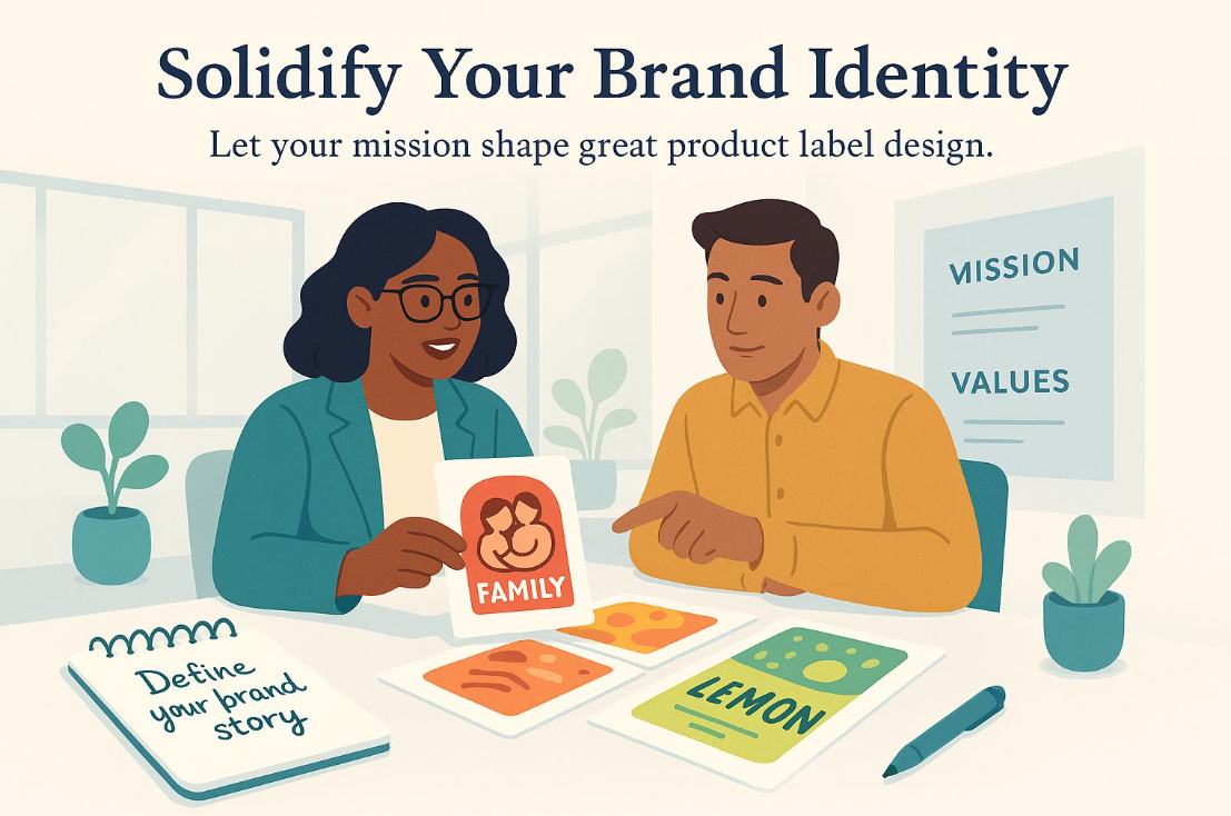
For small business owners and marketers, a product label is one of the most visible and consequential brand assets they will ever create, yet most approach it without the design resources that larger competitors take for granted. A professionally designed label builds instant credibility, communicates brand values at the moment of purchase, and can be the deciding factor when a customer is choosing between two comparable products on a shelf or a screen. This guide covers the best resources, strategies, and practical tips for creating custom labels that look expertly designed without requiring an expert designer.
The Business Case for Investing in Professional Label Design
Labels do more commercial work per square inch than almost any other marketing asset a product-based business produces. Unlike a social media post that a user scrolls past or an email that gets archived, a label stays attached to the product through every stage of the customer journey: the moment of purchase, the experience of use, and sometimes even beyond when a visually distinctive label inspires a photo shared on social media. That extended exposure makes label quality an investment with a long return horizon rather than a one-time cost.
For small businesses competing against established brands, a professionally designed label helps level the playing field. Consumers make rapid quality judgments based on packaging, and a label that looks polished and intentional signals that the product behind it meets a certain standard before the customer has even opened it. Conversely, a label that looks homemade or hastily produced creates doubt about the product’s quality that the product itself then has to overcome.
The barrier to professional-quality label design has come down significantly in recent years. Template-based design platforms with label-specific tools, brand customization features, and print-ready export capabilities have made it practical for any business owner or marketer to produce labels that would previously have required a professional designer. The key is knowing which resources to use and how to use them to their full potential.
What the Best Custom Label Design Resources Have in Common
Understanding what separates a genuinely useful label design platform from one that will leave you frustrated is essential before investing time in any specific tool. Label design has requirements that are more specific than general graphic design, and the best platforms are built with those requirements in mind.
Label-specific templates. The most useful template libraries include designs built specifically for common label applications: product labels, food and beverage packaging, candle and soap labels, health and beauty products, wine and spirits bottles, and retail price tags. Templates designed with label conventions in mind, including the correct use of space for mandatory regulatory information and the visual balance needed for containers of different shapes, produce better starting points than adapted general-purpose designs.
Exact dimension control. Unlike social media graphics with standardized dimensions, labels must match the precise physical measurements of the container or product they will be applied to. A professional label design platform must support custom canvas sizes with exact measurement input in inches or millimeters, not just preset options.
Print-ready export options. A label file submitted to a commercial printer needs to meet technical specifications that screen-optimized exports cannot fulfill. Minimum 300 DPI resolution, proper bleed margins, and support for CMYK color mode are the baseline requirements for print-ready label production.
Typography depth and precision. Labels pack significant amounts of text into small spaces, from brand names and product descriptors to ingredient lists and regulatory information. A platform with a substantial font library, fine-grained text sizing and kerning controls, and the ability to handle very small type sizes is essential for producing labels where all required information is legible and the typographic hierarchy communicates clearly.
Brand consistency tools. For businesses with multiple products or ongoing label update needs, a brand kit feature that saves color palettes, fonts, and logo files for reuse across all label projects is a major practical advantage. It enforces visual consistency without requiring manual reapplication of brand settings for every new label.
Tips for Creating Custom Labels That Represent Your Brand Professionally
1. Confirm Physical Dimensions Before Designing Anything
Setting up the correct canvas dimensions before any design work begins is the most fundamental and most commonly skipped step in label design. Every subsequent design decision, including font sizes, element placement, information hierarchy, and visual proportions, depends on the physical space available. Starting with the wrong dimensions means that a design that looks balanced on the screen will be misaligned, over-scaled, or incorrectly proportioned when applied to the actual container.
To determine the correct dimensions, measure the container the label will be applied to. For rectangular flat surfaces, width and height are straightforward. For cylindrical containers like bottles and jars, calculate the available height and decide how much of the circumference the label should wrap, typically one-third to one-half of the total circumference for a front label. Document these measurements before opening any design tool, and create a simple paper mockup at scale by cutting a blank piece of paper to the target dimensions and holding it against the container to confirm proportions before committing to the design.
2. Use Adobe Express as a Central Platform for Template-Based Label Design
For small business owners and marketing teams who need professional-quality label outputs without a professional design background, the Adobe Express label creator provides customizable label templates, brand kit functionality, and high-resolution export capabilities in a browser-based interface that does not require software installation or design training to use productively. The template library covers a range of label types and product categories, and every template element is fully editable: colors, fonts, images, text, and layout can all be adjusted to match a specific brand identity and product requirement.
The practical value for businesses producing multiple labels is the brand kit integration, which stores brand colors by exact hex value, approved fonts, and logo files so that every label produced automatically reflects the business’s visual standards without manual reformatting. This is particularly useful for businesses launching product lines with multiple SKUs, where visual consistency across the range is as important as the quality of any individual label. Exporting at print-ready resolution ensures that files meet the technical requirements of professional label printers without additional processing steps.
3. Build a Visual Hierarchy That Guides the Eye in the Right Sequence
A label communicates most effectively when it presents information in a clear, logical sequence that the viewer’s eye follows naturally. The hierarchy should move from brand identity to product identification to key product claims to supporting details, each level distinguished from the next by differences in size, weight, color, or placement. When every element on a label is given equal visual emphasis, the viewer cannot quickly extract the information they are looking for, which reduces the label’s effectiveness at both the shelf and the point of extended product use.
Building this hierarchy starts with the brand name or logo as the single most prominent element, followed by the product name at a clearly subordinate but still prominent size, followed by key descriptors or claims that differentiate the product from competitors, and finally the smaller-scale information required by regulation or customer convention. This sequence should be legible in under three seconds, which is approximately how much time a consumer gives a label at retail. Testing your label design by covering it, uncovering it briefly, and then asking whether the key information registered confirms whether the hierarchy is working.
4. Limit and Control Your Color Palette Intentionally
One of the most consistent differentiators between amateur and professional label design is disciplined color use. Labels with too many competing colors look visually chaotic and fail to communicate a coherent brand identity. The most effective product labels typically use a palette of two to four colors, with one dominant hue establishing the brand’s visual personality, one or two supporting colors providing contrast and depth, and a neutral tone serving backgrounds or separating information sections.
Your label color palette should connect directly to your broader brand color system rather than being chosen independently for each product or label project. This connection builds the cross-product visual consistency that creates brand recognition in retail environments and online marketplaces. When you need to distinguish between product variants within a line, changing a single accent color while keeping the rest of the palette constant is a cleaner and more brand-coherent approach than redesigning the entire color scheme for each variant. This approach also makes the product line read as a family on a shelf, which strengthens the impression of an established, organized brand.
5. Choose Typefaces That Serve Both Brand Identity and Practical Legibility
Typography on a label operates under constraints that do not apply to most other design contexts. The brand name and product descriptor can use expressive, characterful typefaces that contribute to brand personality. The regulatory and factual information, including ingredient lists, net weight statements, and manufacturer details, must be legible at very small sizes and is often subject to minimum type size requirements under applicable labeling laws.
For small text, simple geometric or humanist sans-serif fonts maintain legibility at sizes as small as six to seven points in a way that script fonts, heavily stylized display faces, and decorative serif fonts cannot reliably achieve. Reserve the more expressive fonts for the large display elements where their character is an asset rather than a liability. Always proof your typography choices by printing a test label at actual scale, not just evaluating it on screen at high zoom, because small text that looks fine at 200 percent zoom on a monitor can be unreadable at actual label size.
6. Account for Bleed and Safe Zone Margins in Your Setup
The two most common technical errors that cause professionally designed labels to print incorrectly are failing to include bleed and placing important design elements outside the safe zone. Both of these issues are invisible in a flat digital file but produce visibly wrong results in the printed label, and they are entirely preventable if the design is set up correctly from the start.
Bleed is an extension of the background and edge design elements beyond the actual trim line of the label, typically 0.125 inches (3mm) on all sides. This extension accounts for the slight variation in where cutting equipment makes its cut, preventing white edges from appearing on labels where the background color was intended to extend to the edge. The safe zone is the area inward from the trim line where all critical content, text, logos, and important visual elements should be kept, also typically 0.125 inches from the trim edge. Any element placed outside the safe zone risks being cut off in production. Setting up these margins at the beginning of the design process, before placing any elements, is far easier than adjusting a finished design to accommodate them afterward.
7. Design a Complete Label System Before Finalizing Any Individual Label
For businesses with more than one product, designing labels individually and sequentially without an overarching system produces a product line that looks inconsistent, making it harder to build brand recognition across the range and undermining the impression of a professionally developed brand. The more strategic approach is to define the system first, then produce the individual labels within it.
A label system establishes the structural template that will govern all products in the range: the placement and proportional size of the logo, the position and sizing of the product name, the layout zones for descriptors and regulatory information, the font pairing used across all labels, and the fixed elements of the color palette. With this framework established, individual labels differ only in their product-specific content and their variant-differentiating color element. Designing the complete system in a single focused session ensures coherence across the range and makes each subsequent label faster to produce because the core decisions have already been made.
8. Test Your Label on the Actual Container Before Committing to a Print Run
The difference between how a label design looks on a screen and how it looks applied to an actual container can be significant, especially for products in cylindrical, tapered, or irregularly shaped packaging. Text that reads clearly on a flat digital canvas can wrap in unexpected ways on a curved surface. A logo that is centered on the flat file may appear off-center once the label is applied and the container is viewed from a standard angle. Proportions that look balanced in the design tool can feel too small or too large against the actual container.
The simplest way to catch these issues before spending money on a production print run is to print a single draft label at actual dimensions on a standard office printer, cut it to size, and apply it to the product container. This zero-cost test reveals most of the fit, proportion, and composition issues that would otherwise not be discovered until the finished labels arrive. For higher-stakes label launches, most professional label printers also offer short-run proof printing at modest cost, providing a preview of the actual finished label on the correct stock before committing to full production quantities.
9. Align Label Design With Your Digital Brand Assets
Product labels do not exist in isolation from the rest of a brand’s visual presence. Customers who discover a brand online before encountering the physical product, or who photograph a product and share it on social media, create a connection between the label’s visual identity and the brand’s digital presence. When the label and the digital assets feel visually connected, every touchpoint reinforces the same brand impression. When they feel disconnected, the brand appears fragmented and less established.
Aligning your label design with your digital brand assets means using the same logo version, the same color palette, and the same font system across your website, social media presence, and product labels. It also means considering how the label will photograph and appear in digital contexts, such as product listing images on e-commerce platforms and unboxing content shared on social media. Labels with strong contrast, clean typography, and a distinctive visual character photograph and reproduce well across digital surfaces in ways that low-contrast or visually complex labels do not.
10. Document Your Label Specifications and File Versions Systematically
Label design is an ongoing management task, not a one-time project. Products change, formulas are updated, regulations evolve, and brand identities are refreshed. Without a systematic approach to documenting and storing label files, recreating or updating a label that was designed months or years earlier becomes far more complicated and time-consuming than it needs to be.
Create a folder structure that organizes files by product, with subfolders for each version containing both the editable design platform file and the print-ready export, along with a brief notes document that records the printer specifications used, the label stock specified, the exact dimensions confirmed, and the color profile applied. Include a record of when each version was approved and any specific changes made from the previous version. This documentation discipline costs very little to maintain and has significant value every time a label needs to be reprinted, updated, or adapted for a new market or distribution channel.
FAQ: Custom Label Design Resources for Marketers and Small Business Owners
What is the best way to find templates that fit my specific product type?
The most efficient approach is to use a design platform with a label-specific template library organized by product category rather than browsing a general template collection. Platforms that categorize templates by application, such as food and beverage, health and beauty, candle and home fragrance, and retail products, allow you to filter directly to the designs most relevant to your product type. Within those categories, look for templates that match your product’s container shape and size rather than templates that will require significant structural adaptation. A template built for a cylindrical bottle label will require different adjustments to fit a rectangular tin than a template built for a flat package label, and starting from the closest match saves meaningful design time. Beyond structural fit, evaluate templates based on the visual register they communicate, whether that is artisanal and handcrafted, clinical and scientific, luxurious and premium, or playful and accessible, and look for templates that already inhabit the emotional territory closest to your brand positioning.
How do I handle the regulatory text requirements for food, cosmetic, or supplement labels without making the label look cluttered?
Regulatory text is a real design challenge because it is mandatory, typically lengthy, and rarely beautiful. The most effective approach is to treat regulatory content as a distinct design zone rather than integrating it into the main visual hierarchy. Back labels are the conventional location for ingredient lists, nutrition facts panels, and legal disclosures, with the front panel reserved for brand and product identity communication. On front labels where regulatory information must appear, such as net weight statements and allergen summaries, small but clean sans-serif text in a consistent placement that does not compete visually with the primary brand elements keeps the main design from feeling crowded. Designing a label template that has dedicated zones for both the brand-driven creative elements and the mandatory regulatory content from the beginning produces a cleaner result than trying to fit regulatory text into a design that was not planned to accommodate it. For detailed current guidance on specific labeling requirements, Alchemy Systems’ labeling resource center provides accessible guidance on food labeling compliance that is useful for small business owners navigating these requirements.
Should I design my labels in-house or hire a freelance designer?
The right choice depends on the complexity of your label needs, your budget, and how central label design is to your competitive positioning. For businesses with straightforward products in non-highly-regulated categories, professional-grade design platforms with strong template libraries and brand customization tools have made in-house label production entirely viable, and the ongoing flexibility of being able to update and iterate on labels without a designer dependency is a meaningful operational advantage. For businesses where the label is a primary competitive differentiator, where the packaging is in a category with unusually sophisticated design conventions, or where the brand is at a stage where a comprehensive visual identity needs to be established from scratch, investing in a professional designer for the initial development and then using a template-based platform for ongoing production and iteration is often the most efficient approach. In either case, having a capable design platform is valuable, either as the primary production environment or as the tool for adapting and managing professionally developed designs over time.
What label materials and finishes should small business owners know about before designing?
The material and finish of a label affect both how it looks and how the design should be built. Matte label stock absorbs ink and produces a softer, less reflective appearance that tends to feel artisanal and premium in tactile product categories. Gloss label stock reflects light and produces more vibrant color reproduction, which suits bold, color-driven brand identities and products displayed under bright retail lighting. Transparent or clear label stock is popular for products where a no-label look is part of the brand aesthetic, typically in premium beverage, skincare, and fragrance categories, but requires the design to account for the fact that the container color or contents will show through. Metallic foil labels add a premium finish that photographs exceptionally well, making them effective for products sold through e-commerce channels where photography drives purchase decisions. Understanding the material before finalizing the design ensures that color choices, text sizes, and contrast decisions are appropriate for how the finished label will actually look and perform.
How do I ensure color consistency between my on-screen label design and the printed output?
Color consistency between screen and print is one of the most common frustrations in label design, and it results from a fundamental difference between how screens display color (using light-based RGB values) and how printers reproduce color (using ink-based CMYK values). Colors that appear saturated and vibrant on screen can look duller or shifted in hue when printed, and some colors, particularly bright greens, electric blues, and vivid purples, are outside the CMYK gamut entirely and cannot be reproduced accurately in standard process printing. To minimize the gap between screen and print color, design in CMYK color mode from the start if your platform supports it, or convert to CMYK before finalizing your file. Request a printed proof from your label printer before approving the full run, as this is the only way to see actual printed color before committing to production. Communicate any critical color matches to your printer using Pantone (PMS) color references rather than relying on CMYK values alone, as Pantone spot colors can be matched with greater precision and consistency than process CMYK for brand colors where exact hue is important.
Conclusion
The resources available for custom label design in 2026 have genuinely democratized professional-quality packaging for small businesses and independent marketers. Template-based platforms with label-specific design tools, brand kit functionality, and print-ready export capabilities have made it practical for any business owner to produce labels that represent their brand credibly and compete visually in their category, without the cost or timeline of professional design services for every project.
The strategies and tips in this guide address both the creative decisions and the technical requirements that determine whether a custom label looks like a professional production or a home effort. Start with correct dimensions, build from a template that fits your product type, establish a system before designing individual labels, design with print requirements in mind from the first step, and document your files and specifications for the inevitable future updates. Those disciplines, combined with a capable platform and a clear sense of the brand identity the label needs to communicate, are the foundation of label design that works as hard for the business as the product it represents.